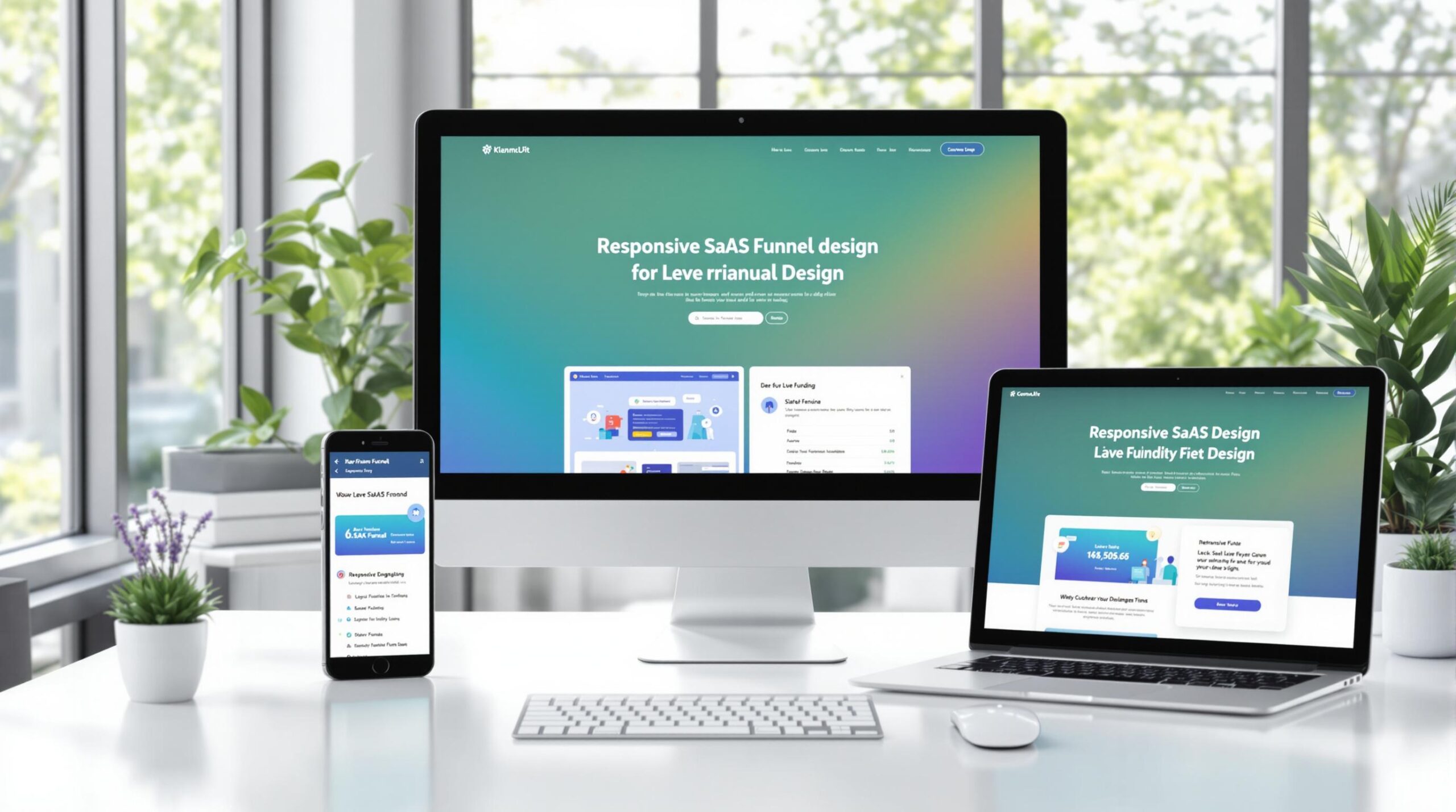
Responsive design ensures your SaaS funnel works smoothly on any device, improving user experience and boosting conversions. Here’s why it’s essential:
- 52% of users leave after a poor mobile experience.
- Mobile-friendly sites see 67% higher conversion rates and 26% more shares.
- Poor mobile performance impacts user trust, with 48% associating it with a lack of effort.
Key Takeaways:
- Mobile-first design: Prioritize navigation, forms, and CTAs for smaller screens.
- Flexible layouts: Use fluid grids, responsive images, and scalable fonts.
- Accessibility: Include alt text, keyboard navigation, and high-contrast colors.
- Faster load times: Aim for under 3 seconds to reduce bounce rates.
- Personalization: Tailor experiences based on user behavior and device type.
Tools to Use:
- CSS Frameworks: Bootstrap, Tailwind, or Foundation.
- Testing Tools: BrowserStack, Chrome DevTools, and Responsinator.
- Analytics: Track device-specific metrics to refine performance.
Responsive design isn’t optional – it’s critical for SaaS success. Start optimizing your funnel today to retain users and increase conversions.
Mobile Responsive Design for Conversion Optimization
Principles of Responsive Design for SaaS Funnels
Creating responsive designs for SaaS funnels is all about delivering a seamless user experience on any device. Here’s a breakdown of the key principles that make it work.
Mobile-First Design Approach
With mobile devices accounting for more than half of web traffic and 61% of users leaving poorly optimized mobile sites [3][1], focusing on mobile-first design is essential.
Some critical elements to consider:
| Design Element | What to Focus On | Why It Matters |
|---|---|---|
| Navigation | Keep menus simple | Makes navigation easier |
| Forms | Limit fields to essentials | Encourages users to complete forms |
| CTAs | Use large, tappable buttons | Boosts click-through rates |
| Content | Prioritize key information | Helps users make quick decisions |
Flexible Layouts and Scalable Elements
Flexible layouts ensure that your funnel looks and works great on any screen size. This is especially important for keeping sign-up forms, CTAs, and other key elements functional and visually appealing.
Here’s how to achieve this:
- Use fluid grids to adapt to different screen sizes.
- Implement responsive images that adjust without losing quality or slowing down load times.
- Opt for adaptive typography to maintain readability on all devices.
CSS frameworks like Bootstrap can make these tasks easier to manage.
Ensuring Accessibility Compliance
Making your funnel accessible ensures you reach a broader audience. Here’s what to focus on:
| Accessibility Feature | How to Implement | Why It Helps |
|---|---|---|
| Alternative Text | Add descriptive image tags | Improves SEO and supports screen readers |
| Keyboard Navigation | Design interactive elements for keyboard use | Makes your site usable for more people |
| Color Contrast | Follow WCAG standards for contrast ratios | Enhances readability and reduces eye strain |
| Clear Typography | Use scalable fonts | Makes content easier to read and understand |
Implementing Responsive Design: Tools and Techniques
CSS frameworks and testing tools make it easier to implement responsive designs. Below, we’ll break down the key tools and techniques you can use to create responsive SaaS funnels that perform well.
Using CSS Frameworks and Media Queries
CSS frameworks provide a great starting point for building responsive designs.
| Framework | Features |
|---|---|
| Bootstrap | Includes pre-built components and a grid system, perfect for quick prototyping. |
| Tailwind | Focuses on utility-first classes, ideal for custom and high-performance designs. |
| Foundation | Offers semantic structure and accessibility, making it a good choice for enterprise-level applications. |
Media queries are essential for tailoring your design to specific devices. They ensure that critical elements like CTAs and forms stay functional and visually appealing:
@media screen and (max-width: 768px) {
    .nav-menu {
        flex-direction: column;
        padding: 1rem;
    }
}
Testing Responsiveness Across Devices
Testing your design on multiple devices ensures it performs consistently for all users.
| Tool | Functionality |
|---|---|
| BrowserStack | Allows testing on real devices. |
| Chrome DevTools | Ideal for local development testing. |
| Responsinator | Provides a visual preview across devices. |
Integrating Analytics for Better Performance
Analytics tools like Google Analytics and Hotjar help pinpoint areas where your responsive design can improve by analyzing how users behave on different devices.
Metrics to monitor:
- Device-specific conversion rates: Understand where users leave your funnel.
- Page load times: Ensure fast loading across all devices.
- User flow analysis: Detect bottlenecks specific to certain devices.
| Analytics Feature | Purpose | Importance |
|---|---|---|
| Event tracking | Tracks user interactions | High |
| Conversion funnels | Monitors completion rates | Critical |
For example, Artisan Strategies helped a SaaS company boost mobile conversions by 25%. They achieved this by refining CTAs and form fields using responsive design and data-driven insights.
With these tools and techniques, you’re well-equipped to build SaaS funnels that work seamlessly across all devices.
sbb-itb-0499eb9
Optimizing Responsive SaaS Funnels for Better Conversions
Reducing Friction in the User Experience
Did you know that 53% of mobile users leave a page if it takes more than three seconds to load? [1] To keep users engaged, focus on these crucial elements:
| Element | Impact | Best Practice |
|---|---|---|
| Page Speed | Reduces bounce rates | Aim for load times under 3 seconds |
| Navigation | Improves user flow | Use simple, streamlined menus |
| Form Fields | Increases completion rates | Keep required fields to a minimum |
| CTAs | Boosts conversion rates | Make them clear and easy to find |
Using Personalization in Responsive Design
Personalized experiences work wonders. For example, personalized CTAs can perform 202% better than generic ones, according to HubSpot [2]. Here’s how you can implement personalization effectively:
| Personalization Type | How to Use It | Impact |
|---|---|---|
| Behavioral | Show content based on user actions | Increases engagement |
| Demographic | Tailor content by location | Makes it more relevant |
| Device-specific | Adjust UI for different devices | Enhances usability |
Tracking Key Metrics for Conversion Optimization
To fine-tune your funnel, keep an eye on these metrics:
| Metric | Purpose | Target Range |
|---|---|---|
| Bounce Rate | Measures user engagement | Keep it below 40% |
| Session Duration | Shows content effectiveness | Aim for 2–3 minutes or more |
| Conversion Rate | Evaluates funnel performance | Exceed industry benchmarks by 20% |
| Click-through Rate | Tracks CTA success | Target above 2% |
Here’s a real-world example: Artisan Strategies increased mobile conversions by 30% simply by improving navigation and speeding up load times.
Key tips for success:
- Adjust content and monitor performance across all devices.
- Test interactive features to ensure they work well on different screen sizes.
- Leverage device-specific capabilities to enhance the user experience.
And here’s a striking stat: 48% of users associate poor mobile performance with a lack of effort from the company (Nielsen Norman Group) [10]. These tactics can make a big difference in how users perceive your brand and interact with your funnel.
Case Studies: Examples of Responsive SaaS Funnel Design
Here are a few examples of how top SaaS companies improved their funnels using responsive design strategies.
1: Improving Mobile Conversions with Streamlined Design
HubSpot tackled the issue of high mobile drop-off rates by making some smart adjustments. They cut the number of form fields from 15 to 7, compressed images to bring load times down to 2.1 seconds, and simplified navigation. The result? A 25% increase in mobile conversions and a 28% drop in bounce rates.
2: Creating a Seamless Experience Across Devices
Salesforce focused on ensuring a consistent experience across devices. They enhanced UI consistency, enabled real-time data synchronization, and optimized dynamic content delivery. These updates led to a 15% boost in cross-device engagement, tripled page load speeds, and ultimately drove a 15% increase in overall conversions.
Artisan Strategies: Expert Funnel Optimization

Artisan Strategies specializes in helping SaaS companies improve their funnels through data-driven insights, device-specific personalization, and continuous updates. Their efforts have led to as much as a 30% improvement in mobile conversions.
"The key to successful funnel optimization isn’t just about making your site responsive – it’s about making it responsive in a way that directly addresses your users’ needs and behaviors across different devices", says Joe Wilkinson, founder of Artisan Strategies.
These examples demonstrate how focusing on responsive design can make a big difference in SaaS funnel performance.
Conclusion and Future Trends
Key Points for SaaS Companies
Responsive design isn’t just a bonus anymore – it’s a must-have for SaaS funnels. It directly affects how users interact with your platform and whether they convert. To stay ahead, focus on three main areas: mobile-first design, continuous testing, and data-driven optimization. These principles lay the groundwork for success.
But the story doesn’t end there. SaaS companies need to gear up for the next big shifts in responsive design.
Future Trends in Responsive Design
Responsive design is constantly evolving, and several trends are shaping how SaaS companies will approach it:
- AI-Driven Personalization: Artificial intelligence will make it possible to tweak layouts, content, and CTAs in real-time based on user behavior. This means more tailored experiences that keep users engaged.
- Voice-Responsive Interfaces: With voice technology on the rise, SaaS funnels will need to integrate voice commands seamlessly, allowing users to switch between touch and voice without friction.
- Advanced Device Adaptability: As new devices hit the market, SaaS funnels must be ready to perform across a range of technologies:
| Device Category | Design Considerations |
|---|---|
| Wearables and IoT Devices | Context-aware interfaces and micro-interactions |
| AR/VR Devices | Interfaces that adapt to spatial environments |
| Next-Gen Displays | Layouts that adjust for foldable or flexible screens |
To stay competitive, SaaS companies should build designs that can evolve with these technologies while keeping usability at the forefront. The goal? Systems that grow with innovation while delivering a seamless experience across every device and interaction.
FAQs
How can I increase my mobile conversion?
Boosting mobile conversion rates involves focusing on user experience and technical tweaks. Here are some practical strategies that have delivered results:
Mobile Optimization Tips
- Design with a mobile-first approach.
- Speed up page load times for quicker access.
- Use large, easy-to-tap buttons.
- Break lengthy forms into shorter, manageable steps.
- Keep content brief and use clear headings.
- Offer multiple mobile-friendly payment options.
- Leverage mobile analytics to identify and address issues.
Here’s a quick breakdown of key areas you should prioritize:
| Optimization Area | Impact on Conversion | Action Priority |
|---|---|---|
| Page Load Speed | High – Reduces bounce rates | Immediate |
| Form Simplification | High – Lowers form abandonment | Short-term |
| Payment Options | Medium – Boosts checkout rates | Medium-term |
| Content Optimization | Medium – Enhances engagement | Ongoing |
| Analytics Integration | High – Informs better decisions | Immediate |

Leave a Reply